Tenda
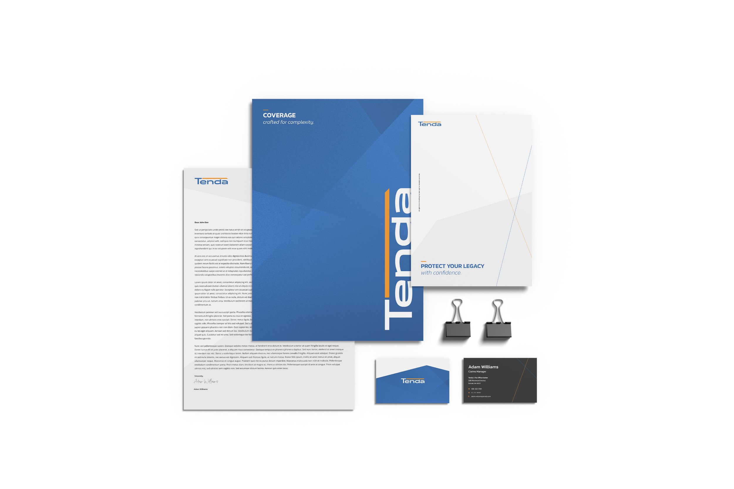
Work created for Tenda while freelancing with the agency Moncur. Tenda is an innovative captive insurance company serving high-net-worth individuals, families, and privately held businesses. The project focused on appealing to two key audiences: family offices and insurance brokers. I was responsible for designing a brand that built on their existing logo while helping Tenda stand out in a traditionally conservative industry. Through competitor analysis, we saw that many established players like Chubb and Vault leaned heavily on dated, corporate aesthetics—muted colors, serif fonts, and templated web design. In contrast, Tenda’s brand was brought to life with a bold, modern, and visually engaging style that set it apart from the competition.
Role: Creative Direction, Branding, Website Layout, Asset Creation
Tools Used: Figma, Jitter, Photoshop
Brand Theme: Dynamic Perspective
The angled line and distinctive typeface in the logo served as the foundation for the overall brand direction. These elements inspired a visual system built around geometric patterns and structured imagery, conveying a sense of strength, stability, and precision—core values in the insurance space. To balance this foundation, we introduced unexpected perspectives and fluid graphic elements that reflect Tenda’s personalized, flexible approach to problem-solving. The result is a brand that feels both grounded and dynamic, signaling to clients that Tenda offers thoughtful, tailored solutions in an industry often marked by rigidity and uniformity.
Typography & Color
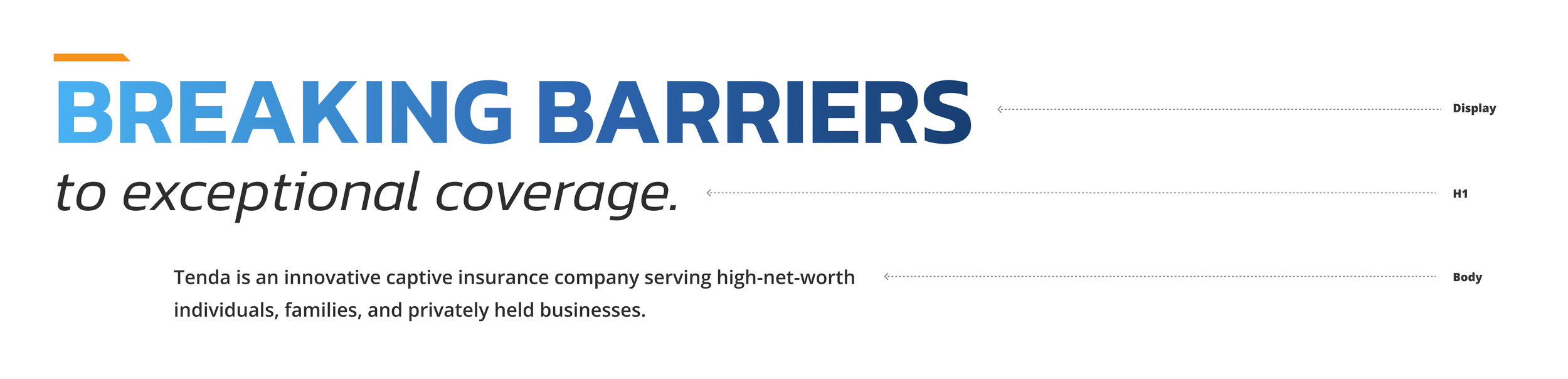
Type
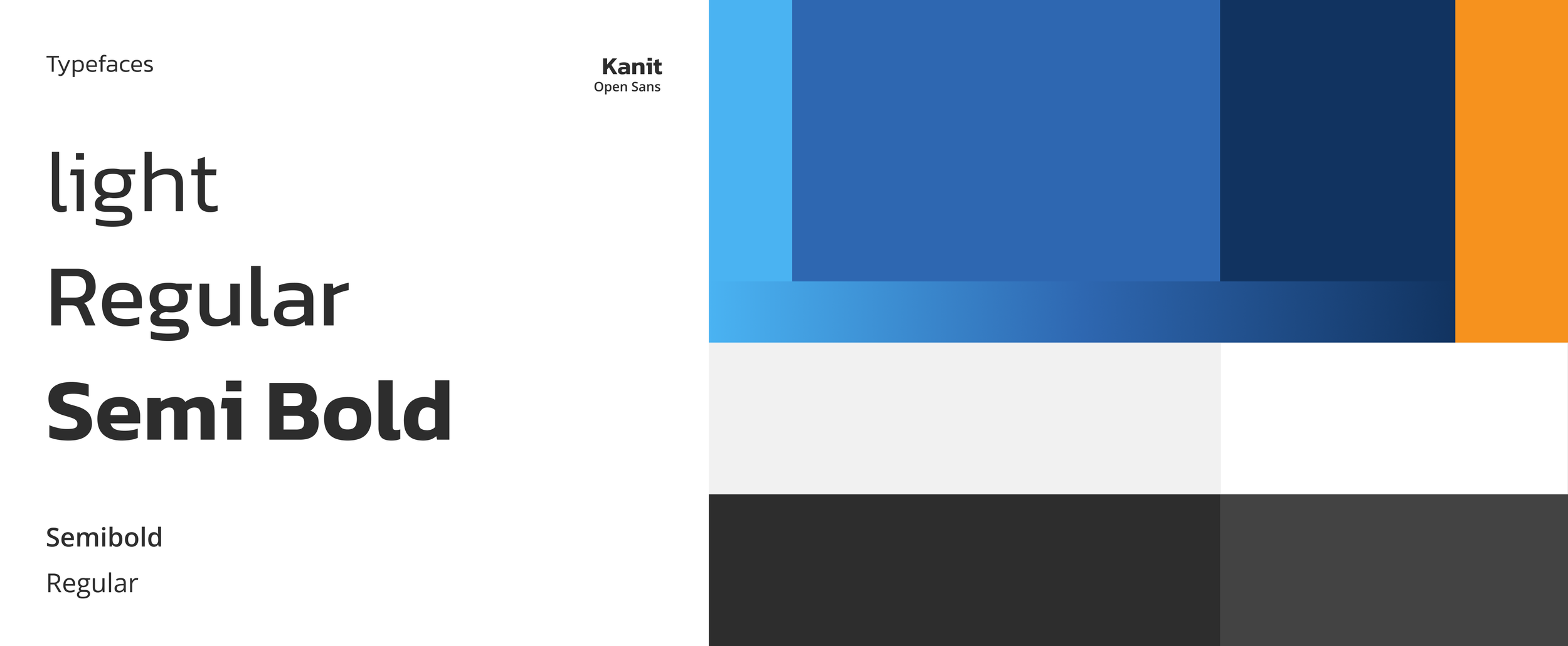
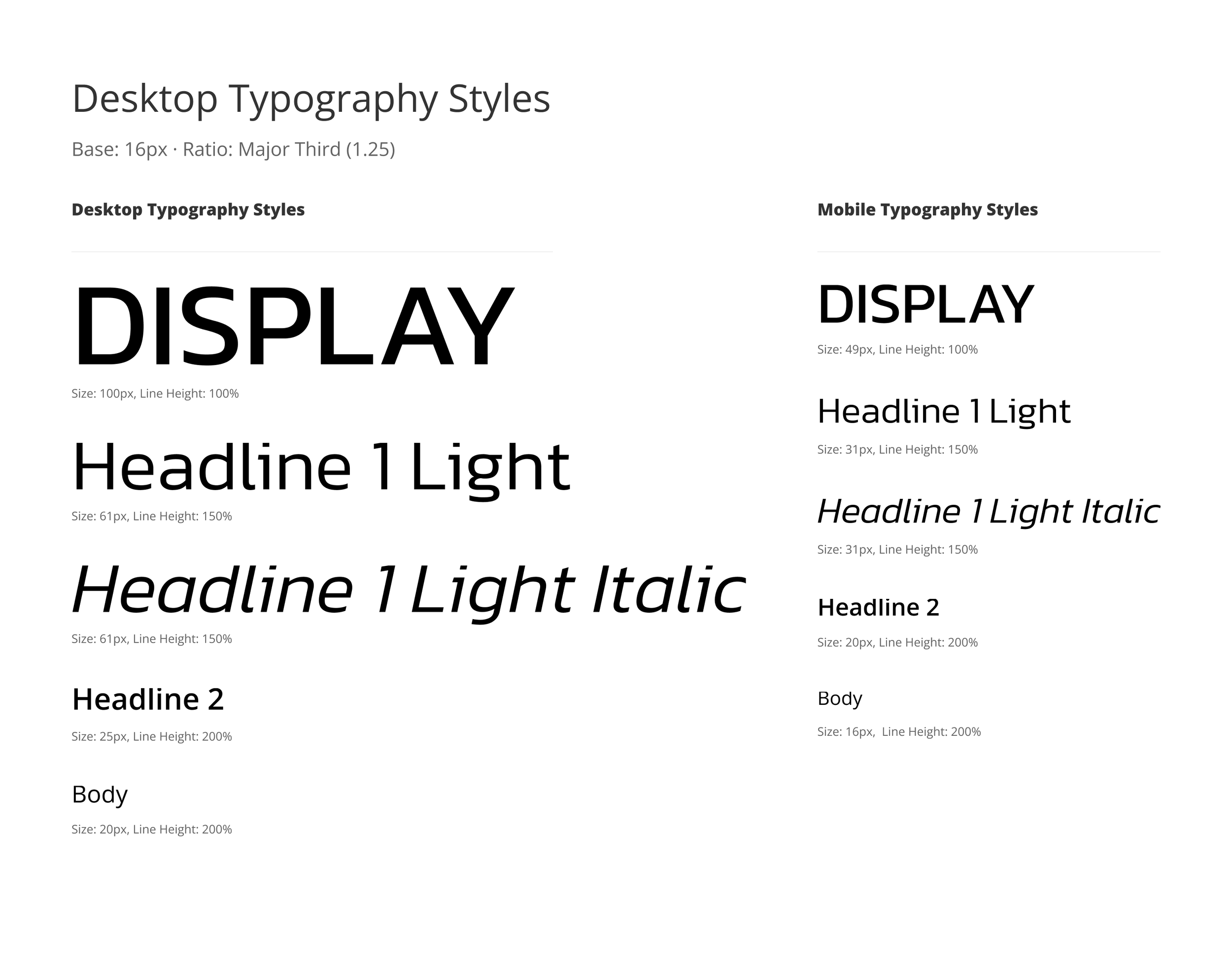
Due to technical limitations, the brand’s typeface had to be selected from Google Fonts. While the exact font used in the logo wasn’t available, I chose a typeface in the same superellipse style—characterized by rounded, geometric curves that strike a balance between softness and structure. This style was consistent with the logo and aligned well with the overall brand direction. Ultimately, I selected Kanit as the primary typeface. It echoed the logo’s feel while offering improved versatility and legibility, especially with its slightly narrower width. Kanit also featured angular details, like the cut on the lowercase “i,” that complemented the logo’s angled line. For body copy, I used Open Sans, as superellipse fonts tend to lose clarity at smaller sizes. I paired Kanit Semi-Bold in all caps with Kanit Light Italic for headlines, creating a balance of strength and fluidity. As an added brand touch, I incorporated the logo’s orange line as an eyebrow accent above H1 styles.
Color
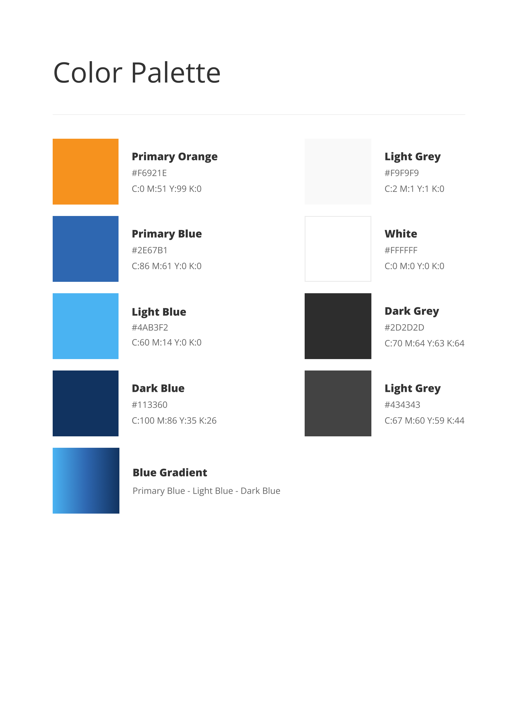
For the brand colors, we were initially provided with a primary blue and orange. These vibrant, high-contrast colors offered a strong starting point. To expand the palette and add depth, I developed lighter and darker shades of the blue, which could also be combined with the core blue to create a versatile three-color gradient. This helped avoid a flat visual tone and added more dimension to the overall look. The orange, while energetic, was used sparingly since large areas of it felt too intense. Instead, it served effectively as an accent—highlighting elements like the eyebrow graphic above H1 headlines and active CTAs. I also introduced a light grey to complement the white background, allowing for subtle shifts in tone on web interfaces. Two additional shades of dark grey were added: one for typography and primary background areas, and a lighter version for soft, secondary backgrounds. Together, these additions created a more flexible and balanced color system for the brand.
Website
The primary deliverable, beyond the brand identity, was the website. The client requested a simple one-page site focused on showcasing their capabilities. Because Tenda offers bespoke insurance solutions rather than off-the-shelf products, the site wasn’t built around sign-ups or transactions. Instead, the goal was to communicate three core messages: we exist, we are credible, and we are innovative—solving complex problems in a niche market. Building on the visual language established in the brand, the site was designed to be dynamic and engaging, guiding users through Tenda’s story and services as they scroll. The only call to action appears at the end, inviting users to submit a form and start a direct conversation about their unique insurance needs.